A responsive site is a site that changes depending on the screen size that the user is viewing it on.
It is important because if the site didn't adapt to a mobile screen from a desktop screen, it would be very difficult for mobile users to navigate around the site. They would have to scroll left and right and up and down a lot, it would be very difficult to read the very large text, and to push on small links.
Mobile first design is designing the page for a mobile screen first, and then using media queries to change things as the screen gets larger, rather than designing the site for desktop users, and editing the site as the screen gets smaller.
This is important because it is much harder to get rid of content than adding content, so it is easier to decide what makes it onto the mobile site.
Frameworks are a standardised collection of code. You can use frameworks to help buid a website.
Frameworks are useful as they make it easier to build a website, and to keep the code neat.
However, frameworks aren't all good. They resolve common issues which means that although it's easier to make the site, you don't learn how to resolve the issues yourself.
It also mixes content and style rather than keeping them completely separate.
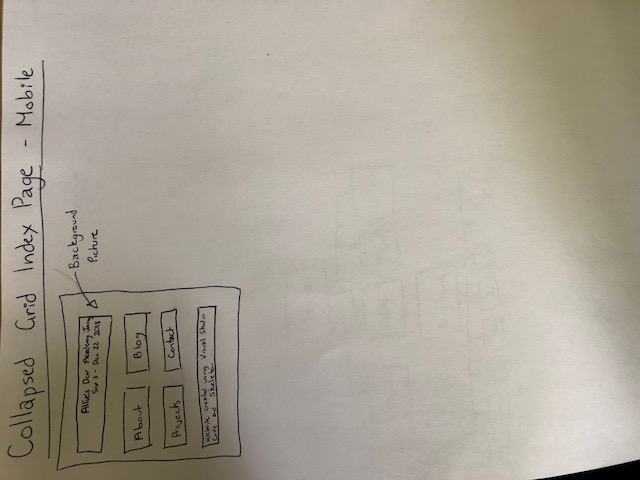
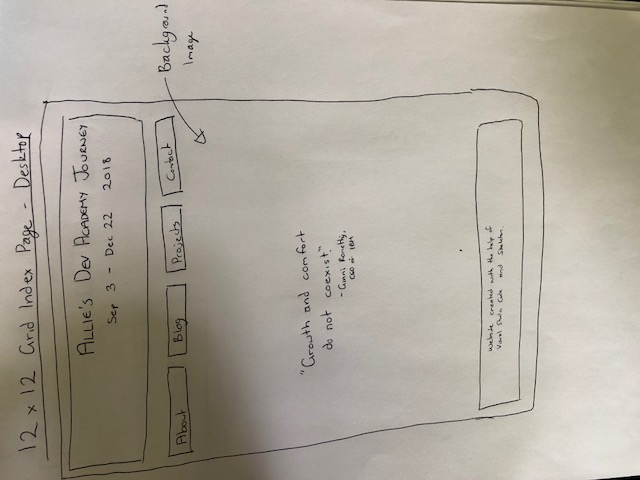
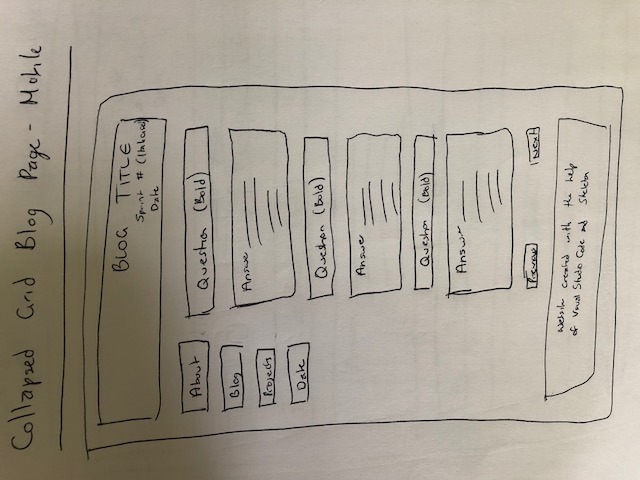
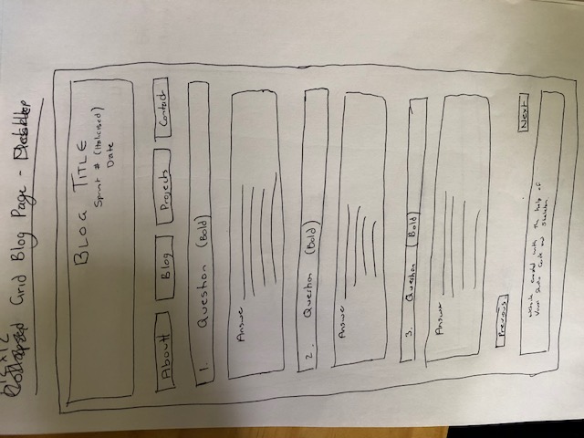
Wireframes are sketches of what you want the page to look like.
Wireframes can make it easier to code the site because you have a reference to look at. You can rearrange and make decisions on the layout and styling before beginning to code which saves a lot of time changing the code afterwards.
My wireframes are below. I couldn't implement the separate squares for the nav bar because I couldn't figure out how to line them up and space them out. I also found it difficult to implement the background picture as it took a really long time to figure out how to do it where the image took up the entire background, and it wasn't repeating itself.